Aura is an app that helps users watch movie trailers and book tickets online. I worked on designing a seamless experience for selecting and booking movie tickets and optimising the checkout process.
My role
Lead UX designer from conception to delivery.
Responsibilities
Conducting interviews, wireframing, prototyping conducting usability studies, accounting for accessibility, and iterating on designs.
Challenges
- Create easy-to-understand interface visuals for users
- Create a one-way stop solution for users to watch trailers and book tickets online
- Account for accessibility features
Project duration
May 2021 to July 2021
The goal
Design an app with a clear user interface that will ease the ticket booking process. Users can share tickets with anyone they reserved/punched tickets with. Check movie show timings, get preferred seats and get discounts on them too.
User research
I conducted interviews and created empath maps to understand the users I’m designing for and their needs. A primary user group identified through research were adults who wanted an app to watch trailers, read reviews and book tickets online. This user forum confirmed initial assumptions about finding an app that would help users book movie tickets, but research also revealed that time was not the only factor limiting users from booking tickets online. Other user problems included interest, challenges that make it difficult to book tickets at the theatre and different obligations.
Meet the user
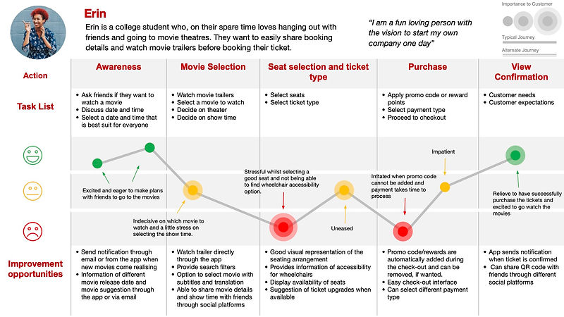
Erin
Age: 24
Education: Master's degree, 2nd year
Occupation: Business Development (sales) intern
Hometown: London, UK
Erin is a college student who loves hanging out with friends and going to movie theatres in their spare time. They want to easily share booking details and watch movie trailers before booking their ticket.
Erin's journey map
Mapping Erin's user journey map revealed how helpful it would be for users to have access to an app dedicated to watching trailers and booking movie tickets.
Competitive audit
An audit of a few competitors' products provided direction on gaps and opportunities to address the Aura App.

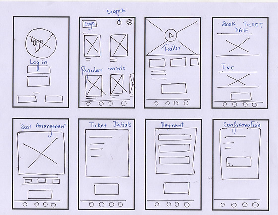
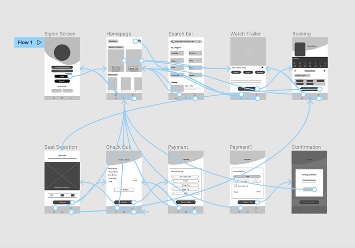
Ideation
Before moving into high-fidelity wireframes or mocks, I took some time to draft iterations for each screen of the app on paper to get a feel for what the core app is going to look like whilst also ensuring that the elements that will be added into the digital wireframes would be well-suited to address user pain points.

Digital ireframes
As the initial design phase continued, I made sure to base my design on the feedback and findings from user research and design the app with features that would address user pain points.
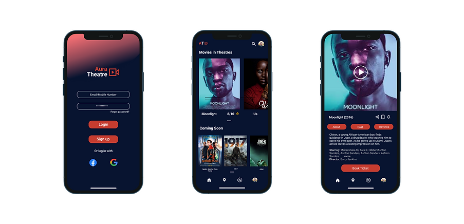
This screen provides users with the convenience to watch movie trailers straight from the app.
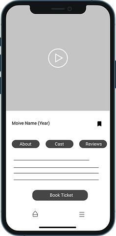
This button provides an easy option for users to see ratings and reviews of the movie.
Providing a visual representation of the seating arrangement would help users select seats easily. In addition to equipping the app with accessibility such as the representation of wheelchairs on the seats through icons.
Adding visual representation of the theatre seating arrangement helps users to easily select seats.

Low-fidelity prototype
The low-fidelity prototype connected the primary user flow of watching a movie trailer and booking a movie ticket, so the prototype could be used in a usability study with users.
View The Aura Theatre low-fidelity prototype
Usability study
I conducted two rounds of usability studies. Findings from the first study helped guide the designs from wireframes to mockups. The second study used a high-fidelity prototype and revealed what aspects of the mockups needed refining.
1. Round one findings
2
- Some users were having difficulty creating a profile.
- The Date and time booking page was confusing
3
- Users wanted filter on search bar
2. Round two findings
Some of the Call-to-action buttons needs better UI
The colours on the buttons were sometimes hard to see and therefore, might not be accessible to some users
Mockups
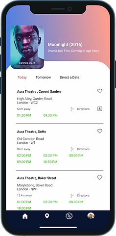
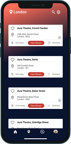
At the early stage of design, the app allowed for some customization with the change in theatre location, the date and time would change automatically, but since the design seemed confusing, I made the design more simple by adding the theatre names and their timetable together. The nearest theatre is placed on top of the list. Users can also select a different date with the “Select a date” option.

The second Usability study revealed that some users were finding it difficult to read text on the buttons, thus making it not accessible to a lot of users. I scanned the colour of the buttons on WebAIM and found that it was too light, therefore, I changed the colour to a darker shade.

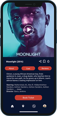
Accounting for accessibility, the app was designed to create a better user experience for all users. The use of the International Symbol of Access aims to provide users with a visual representation of whether a theatre can be accessed by someone in a wheelchair.

Final mockup


High-fidelity prototype
The final high-fidelity prototype presented a cleaner user flows for selecting movies and theatre and booking a movie ticket. It also meets users' needs by creating offer options coupon codes, filters on the search bar and more payment options.
View the Aura Theatre high-fidelity prototype

Accessibility considerations
1. Used colors that have been checked on WebAIM for accessibility and readability on the app
2. Used Icons to help make navigation easier.
3. Provides accessibility information for wheelchair access
Design guide
For the Aura Theatre's branding, I used energetic and lively colours. The red helps evoke a strong energetic colour whilst the dark blue evokes a calming effect giving a nice balance of energy and calmness. The colours on the screen change with the content, making the screen more responsive and lively. The main typeface of choice was Roboto.
Takeaways
Producing this app has helped me learn about empathy and how important it is when designing a product/app. Creating this app has also made me realise the importance of accessibility and how it can improve the user experience of an app.
Moving forward from this product, I want to find more innovative ways to practise a more inclusive design with accessibility in mind.
Reach out to me!
Interested in working together?
Let's Connect!


©️ 2023 Lipoksanen Jamir