ChildAid is an international donation app and responsive website. I worked on designing the user flow for donation/volunteering and the overall experience of the UX for both the website and the app
My role
Lead UX Designer for the app and responsive web from conception to delivery.
Challenges
- Create a seamless and easy-to-use interface
- Create opportunities for users to donate/volunteer
- Transparency of the app
Responsibilities
Conducting interviews, wireframing, prototyping conducting usability studies, accounting for accessibility, iterating on designs, determining information architecture and responsive design.
Project duration
July 2021 to August 2021
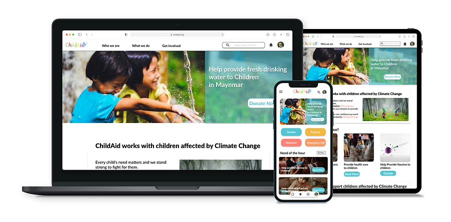
The goal
Design an app that will create awareness on climate change and a platform to help children across the world affected by it. The app will have organised visuals and clear descriptions for every donation/project to present a clear user flow.
User research
The primary user group identified through research were college students and adults who wanted to help children affected by climate change but did not know how to help them. The feedback received through research made it clear that if allowed a platform to help children through different campaigns and projects, they were willing to help. Users were willing to donate if given a secured and transparent platform to select and create personalised donation projects.
Meet the Users

Akira
Age: 48
Occupation: Art Director
Hometown: East London
Akira is an Art Director at a Museum who needs to find a platform where she can make a monthly donation because she wants to help children affected by different calamities.

Hrishi
Age: 48
Occupation: University Student
Hometown: London
Hrishi is a university student who needs to find a way to contribute to society because he wants to help people in need.
Competitive audit
An audit of a few potential competitors provided direction for gaps and opportunities to address the ChildAid app. I evaluated several features from the competitor's app to understand which features were working and which were vital for a clear user flow.
Most of the features between the competitors were similar, however, some of the main features that we found different were:
- Too many screens Vs Simplified interaction
- Too much Information vs minimal information
- Poor navigation vs clear navigation


Ideation
I did quick ideation on how to design the app with reference to the competitive audit. The focus of the ideation was to help users find different options to donate/contribute to helping children affected by climate change. Providing a more personalised user experience and easing the user flow.

Digital wireframes
After ideating and drafting some paper wireframes, I created the initial designs for the ChildAid app.
This design focused on helping users choose a personal path on how they want to contribute and suggest important topics to users.
This feature helps users to easily find recent/emergency aids and keep them up-to-date with important projects.
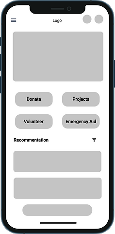
The option to choose different ways for a user to contribute making it less confusing with a very straightforward user flow.
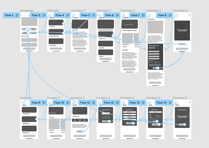
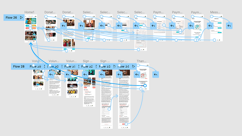
To prepare for the usability study I created a low-fidelity prototype that connected the user's flow of choosing a cause and donating a monthly donation to a charity. And the other user flow of choosing a cause and successfully signing a petition form.
View the Childaid low-fidelity prototype
Iteration
After creating our prototype from low-fidelity wireframes, prepared a questionnaire survey for the participants to fill out before the usability study. I asked 8 of my participants to run through the app in hopes to gather feedback for my next design iteration.
1. Section heading
People want to know the specific heading of a section and having “recommendation” was confusing so the heading was changed.
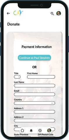
2. Payment information
People wanted the option of adding another name or editing their name during the payment process.
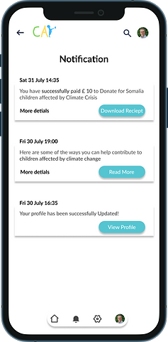
3. Notification
Users wanted to get notified about their payment process along with the payment receipt
Mockups
Based on the insight from the usability study. I applied a design change to the user flow. Users wanted an option to edit/add new user information during the payment process.
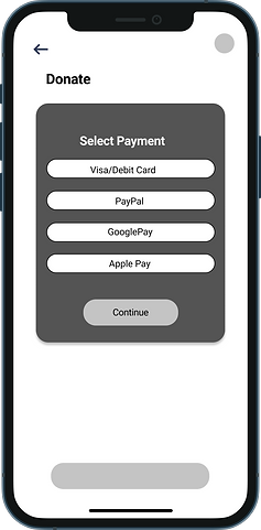
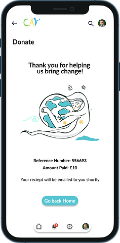
Additional design changes included a major design change to the ‘payment successful page’ and a feature was added where the user would be notified during the completion of the payment and they can download the receipt directly from the notification tap.

Final Mockup

High-fidelity prototype
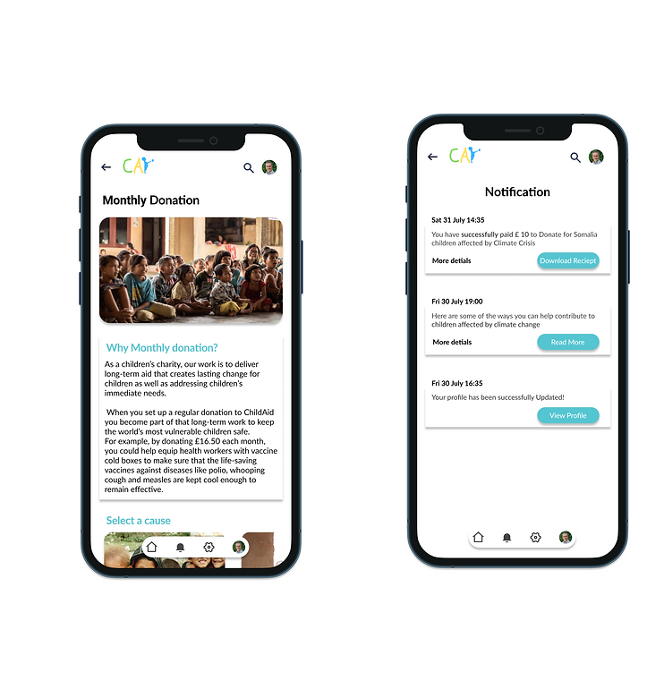
The high-fidelity prototype follows the same user flow as the lo-fi prototype, with design changes made after the usability study.
View the Childaid high-fidelity prototype
Accessibility considerations
1. Accessible Content
Text and images were made clear with layouts and interactive elements that screen readers can read it.
2. Streamlined UX
Designing the app for much easier use with user paths already created for clear navigation. The app was designed for quick access to complete tasks easily
Sitemap
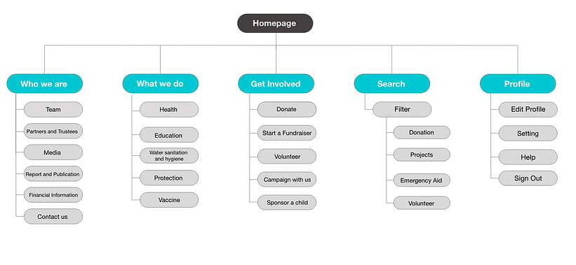
With the app design completed, I started working on the responsive app for various screen sizes. I used the ChildAid sitemap to design the structure of each screen’s design to ensure a cohesive and consistent design across all devices.
Responsive website
I design the screens to fit different devices screens including phones, tablets and desktops. I optimised the screens to meet the user needs of each device and screen size

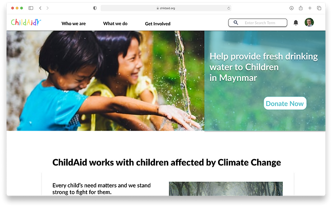
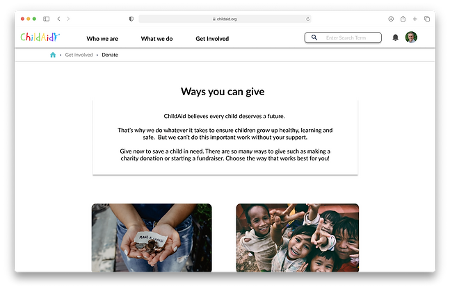
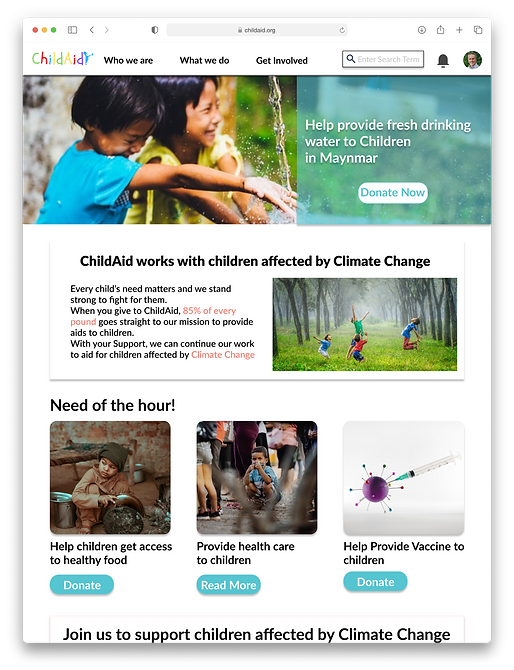
ChildAid's website on a desktop
ChildAid's website on a mobile phone
ChildAid's website on a tablet
Design guide
For ChildAid's branding, I used cool and calming colours. The blue helped evokes a soothing feeling whilst the yellow and orange evoked warmth and positivity. The main typeface of choice was Late. With its very clean and versatile use of uppercase and lowercase styling, goes well with both dark and light text fills.
Takeaways
ChildAid is the first charity application that I produced. It made me realise how important it is to include financial transparency in the app/website. Usability studies also played an important element whilst designing the app, with a lot of users' needs and pain points identified, addressing those issues made the app to be more user-centred and useful.
I am looking forward to conducting more usability studies and the user flow of the app and responsive website.
Reach out to me!
Interested in working together?
Let's Connect!
©️ 2023 Lipoksanen Jamir

