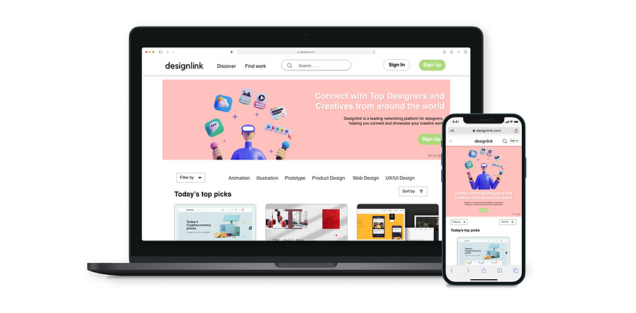
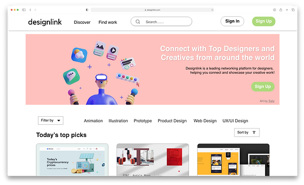
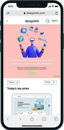
Designlink is a networking platform for designers. It allows users to showcase their creative work, and connect with designers and clients. I worked on creating the user onboarding journey and responsive web design
My role
Lead UX Designer from conception to delivery.
Challenges
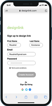
- Create a clear interface for user signup flow
- Eliminate barriers during user account creation
- Create a minimalistic UI
Responsibilities
Conducting interviews, wireframing, prototyping conducting usability studies, accounting for accessibility, iterating on designs, determining information architecture and responsive design.
Project duration
June 2021 to July 2021
Goal
Design a website that is user-friendly with clean and easy navigation. The signup process is simple and users can add or delete sections on their profile page
User research
I conducted interviews and created empath maps to understand the needs of the users I’m designing for. A primary user group identified through research were designers who wanted a networking website, where they can connect with designers and potential clients.
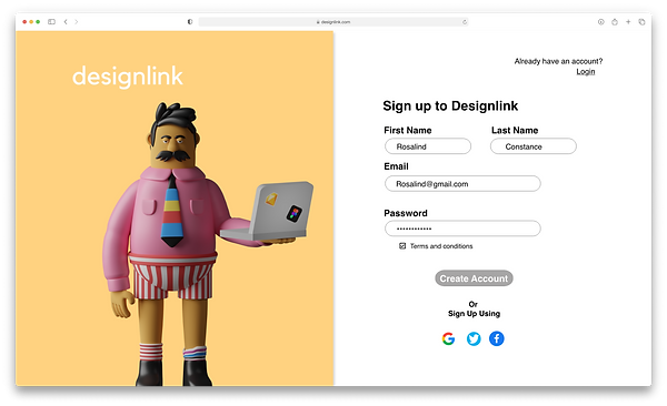
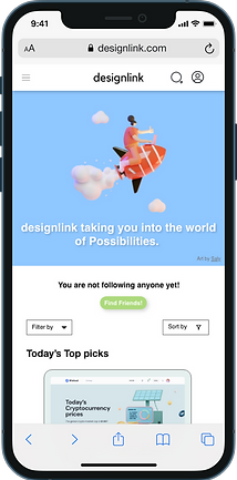
This user forum confirmed initial assumptions about finding a website that would effortlessly help designers to easily sign-up to a networking website where they can connect with the design community and showcase their creative work. However, research also revealed that networking was not the only factor limiting users from booking tickets online. Other user problems include complicated account creation flow and websites with the clustered layout.
Meet the user

Rosalind
Age: 31
Occupation: UX Designer
Hometown: Uxbridge, London
Rosalind is a rookie freelance UX Designer who needs to network with other fellow designers and find clients because they want to get inspiration and showcase their design.
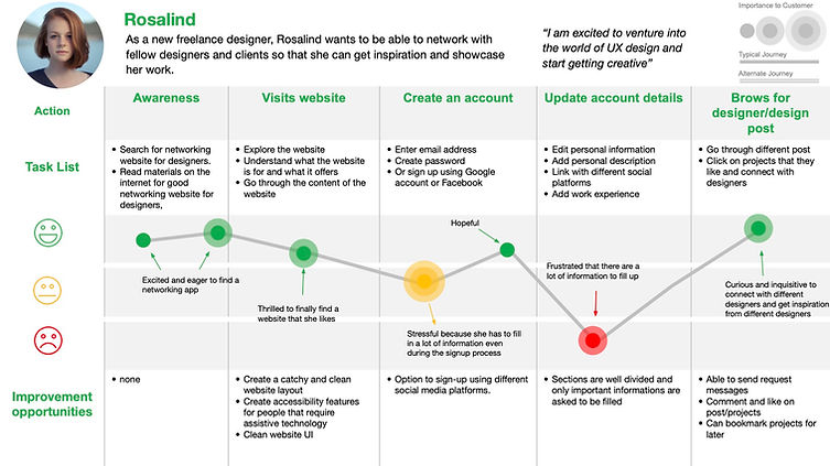
User journey map
Mapping Rosalind's user journey revealed how helpful it would be for users to have access to a website dedicated to designers to network and showcase their creative work.
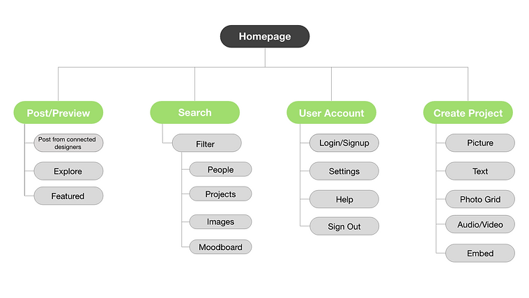
Sitemap
Complex website navigation was the primary pain point for users, with this information I created a sitemap.
One of the main aims whilst creating the site map for the website structure was to make it simple and easy for users. The importance of having a well-thought information architecture can help achieve a user-centred website.
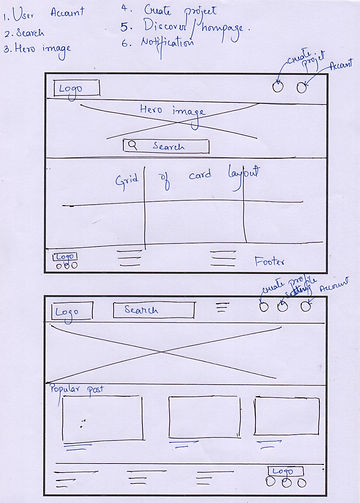
Ideation
Before moving into high-fidelity wireframes or mocks, I took some time to draft iterations of the website navigation on paper to get a feel for what the core app is going to look like whilst also ensuring that the elements that will be added into the digital wireframes would be well-suited to address user pain points, which was the navigation of the website whilst optimising the browsing experience of the users.
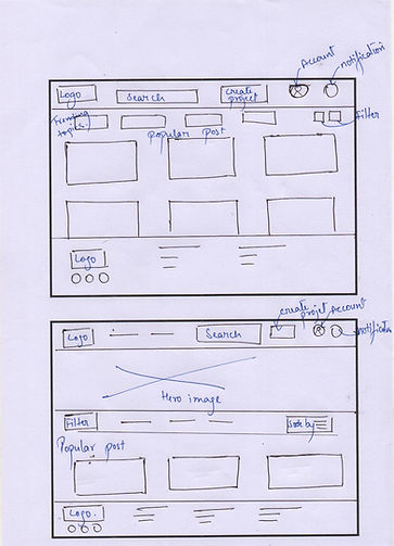
Digital wireframes
Creating digital wireframes provided an opportunity to look more into user usability and get a better understanding of the site's navigation and address user pain points to improve the overall user experience of the website.
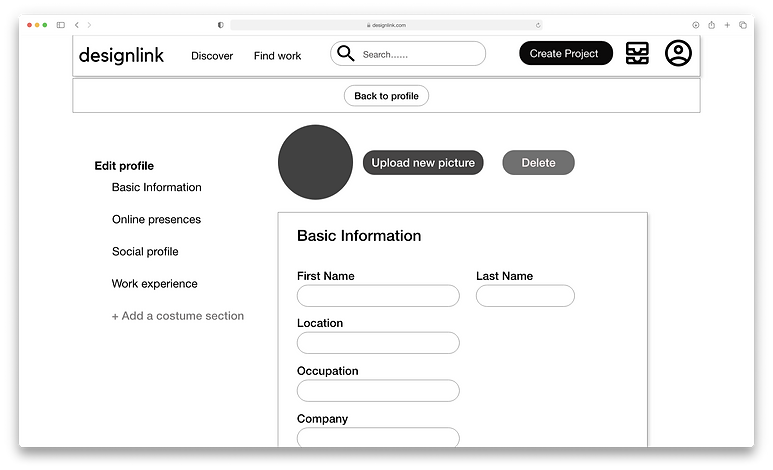
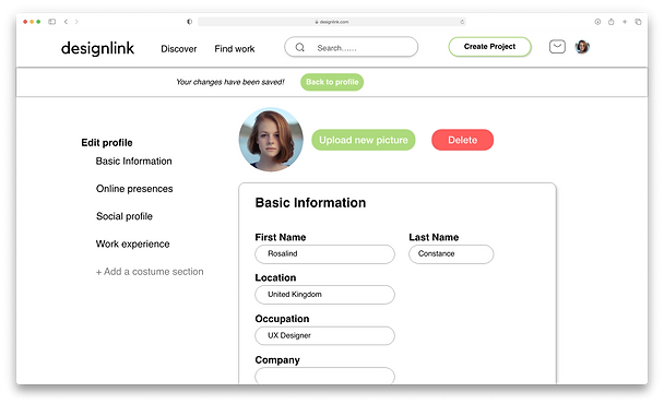
Providing an option for users to customise/create their section, gives them the freedom to add personalised information. Adding a 'back to profile' button that stays fixed whilst scrolling makes it easier for users to go back to their profile and the autosave feature minimises users' steps to complete a task.
%20-%20Light.png)
Option to create own section
Easy navigation button to go back to the profile screen
Digital wireframe:
Screen size variation

Low-fidelity prototype
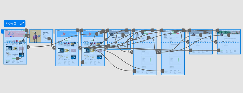
The low-fidelity prototype connected to the primary user flow of signing up to the website and adding additional information to create a complete profile.
Whilst, at this point, I have already received feedback on the layout of the website and I have made changes to areas that needed improvement. I am happy with the button placement and the user navigation of the website.
View the Designlink low-fidelity prototype

Iteration
After creating our prototype from low-fidelity wireframes, prepared a questionnaire survey for the participants to fill out before the usability study. I asked 8 of my participants to run through the website in hopes to gather feedback for my next design iteration.
1. Autosave
Adding a feature where if changes are made whilst editing the profile, it is automatically saved, without the user needing to manually do it.
2. Call to action button
The colour used on the call to action button made it hard to read what was written on the buttons.
3. Navigation
The call to action button kept on the end of the screen meant users had to scroll down to the bottom to go back/move forward to the other page.
Mockups
Adding a function where when a user changes some of the information on the ‘edit profile’ page, it is automatically saved, which reduces the task for the user. The banner that displayed the information is fixed, so even if the user scrolls through the page, they would still notice that changes which were made are saved automatically.
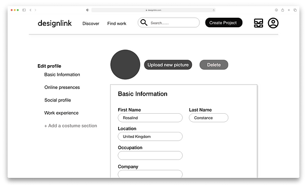
One of the pain points that a lot of the users stated was the ‘call to action’ buttons located at the bottom of the page, which made users scroll down just to save changes or go back to the profile. Therefore, changes were made and the ‘back to profile’ was added on the top of the page that is fixed to the screen so users can easily navigate through the page with ease.

Final mockup: Original screen size

Mockups: Screen size variations
Designlink was designed to perform as a responsive website, here I have included images of the website on a mobile device. Website today, are used in various screen sizes and it is important that designers are able to provide a responsive website for a more enriched user experience.
High-fidelity prototype
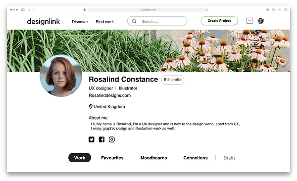
The final high-fidelity prototype presents a cleaner user flow with changes to the layout made after the usability study.
View the Designlink high-fidelity prototype
Accessibility considerations
1. I used headers with various size to create visual hierarchy
2. I added landmarks to help users navigate through the site, including for users who rely on assistive technology.
3. I designed the site with a text atl option to enable the screen reading feature.
Design guide
For the Designlink website, I wanted to take a minimalistic approach to the brand. I decided to use green as the main colour which evoked a sense of freshness, growth and ambition. The typeface for designlink is Helvetica.
Takeaways
Impact
Our target users shared that they were able to the design was easy to navigate through with text size and colour creating a clear hierarchy. Having an easy signup process where users can sign up without any hassle through different social platforms and not think about adding more information made the process very easy.
What I learned
I have learned that every step of the design process is very important. And as a UX designer bringing the user's needs first when iterating and designing a product is crucial. Empathising with users and focusing on user needs and pain points can help create exceptional products.
Reach out to me!
Interested in working together?
Let's Connect!


©️ 2023 Lipoksanen Jamir